

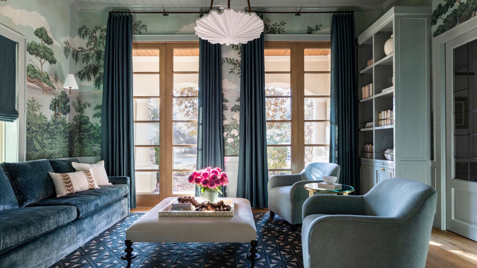
Patterned walls have a way of transforming a room. A floral wallpaper can make a bedroom feel romantic, a geometric print can sharpen a contemporary space, and a traditional damask can bring instant character to a dining room. But once the walls are doing the decorating, the windows can present a tricky question: what exactly should you put on them?
The answer is not always “plain curtains.” While a solid fabric is often the easiest solution, patterned walls can actually create an opportunity to layer color, texture, and pattern in a much more considered way. The key is knowing when to let the curtains quietly support the walls and when to introduce another pattern into the mix.
Rather than treating the window and wall as separate decorating decisions, think of them as two elements of the same composition. When their scale, color, texture, and visual weight are balanced, even richly patterned rooms can feel polished rather than overwhelming.
Decide Which Pattern Should Take Center Stage
The first step is deciding which element you want to command attention. If your walls feature a large-scale, colorful wallpaper, they are probably already the focal point. In that case, curtains with a restrained color and subtle texture can frame the windows without competing with the pattern.
If the wallpaper is relatively quiet, however, the curtains can take on a more decorative role. A small-scale floral wallpaper might work beautifully with a larger botanical curtain, while a subtle geometric wall treatment could provide the perfect backdrop for a bold stripe at the windows.
The goal is not to make every element equally noticeable. A well-designed room usually has a visual hierarchy, with some details leading and others supporting. Once you decide which pattern should lead, choosing the curtain fabric becomes considerably easier.
Don’t Assume Patterned Walls Require Plain Curtains
Solid curtains are a reliable choice, but they are not your only option. In fact, using two patterns can make a room feel more sophisticated when the relationship between them is carefully considered.
The trick is to avoid choosing patterned curtains and patterned wallpapers that compete in exactly the same way. Two large-scale florals in equally strong colors may fight for attention, while a large botanical wallpaper paired with a restrained stripe can create an interesting contrast. Similarly, a small repetitive wall pattern might provide a subtle backdrop for a larger, more expressive curtain motif.
The patterns do not need to match, and they arguably should not. What matters is that they have enough difference in scale, style, or visual weight to coexist comfortably.
Pay Attention to Scale
Scale is one of the most useful tools when combining patterns. If your wallpaper has a dramatic, oversized motif, consider a curtain pattern that is smaller or more restrained. This creates a natural hierarchy and prevents the two surfaces from competing.
The reverse can work beautifully, too. A small-scale wallpaper can act almost like a textured background, allowing a larger-scale curtain pattern to become the main event. This can be particularly effective in rooms where the windows are a significant architectural feature.
Think about how much visual space each pattern occupies. A bold curtain across a wall of windows can have considerably more impact than the same fabric used on a small pair of shades, so scale should always be considered in relation to the size of the treatment as well as the size of the room.
Use Color to Connect Different Patterns
Patterns do not have to look alike to belong together. One of the easiest ways to create cohesion is to repeat a color between the walls and windows.
Imagine a botanical wallpaper featuring sage green, ivory, and muted blue. The curtains could feature a simple blue-and-ivory stripe, even though the stripe has no botanical element at all. The shared colors establish a visual connection while allowing each pattern to retain its own identity.
You do not need to repeat every color from the wallpaper. Choosing one or two shades as a bridge is often enough. This approach feels much more sophisticated than selecting custom curtains that attempt to replicate the entire wallpaper design.
When in Doubt, Let Texture Take Over
If your walls are already highly decorative, texture can provide the perfect alternative to another print. A textured solid curtain adds dimension and softness without introducing another competing motif.
Linen is particularly effective for this purpose. Its natural weave can soften an elaborate wallpaper while maintaining an elegant, understated appearance. Velvet can bring richness and depth to a room with a delicate floral or traditional pattern, while textured cotton can create a more relaxed atmosphere.
This approach works especially well when the walls already provide plenty of color. Rather than adding another pattern, allow the curtains to contribute through material, movement, and light.
A neutral textured fabric is rarely as visually quiet as it sounds.
Consider the Style of Your Wallpaper
The character of the wallpaper should influence the character of the curtains. A traditional floral, damask, or chinoiserie-inspired print can work beautifully with classic fabrics such as linen, cotton, or velvet. A contemporary geometric wallpaper may call for something more streamlined, such as a solid textured fabric or a simple stripe.
But there is no rule saying the two styles have to match.
In fact, mixing design eras can create a much more interesting room. A traditional floral wallpaper paired with simple linen curtains can feel fresh and relaxed, while a contemporary room with classic patterned drapes can gain warmth and character.
The contrast should feel intentional rather than accidental.
Look at the Rest of the Room
The wallpaper and curtains are not operating in isolation. Your rug, upholstery, artwork, bedding, and accessories all contribute to the room’s pattern mix.
If you already have a patterned rug and decorative upholstery, adding another strong print at the window may push the room beyond the point of visual comfort. In that situation, a solid or subtly textured curtain can provide valuable breathing room.
On the other hand, if the rest of the furnishings are relatively quiet, the windows may be the perfect place to introduce another pattern.
There is no magic number of patterns that a room can handle. What matters is their combined scale, color intensity, and visual weight.
Use Solid Curtains Strategically
A solid curtain can actually make patterned walls look more luxurious because it gives the eye somewhere to rest. But “solid” does not have to mean boring.
Consider using color, texture, and fabric weight to give the treatment personality. A rich velvet in a shade pulled from the wallpaper can create a dramatic, sophisticated effect. A natural linen can soften a traditional print. A deep neutral can ground a room filled with lighter, more delicate patterns.
You can also use subtle tonal variation. If the wallpaper is warm white, for instance, an oatmeal or ivory curtain can create a gentle contrast without introducing a completely new color.
The absence of pattern does not mean the absence of design.
Think About Curtain Length and Fullness
When the walls are patterned, the construction of the curtains becomes even more important. A clean silhouette can help keep a heavily decorated room feeling controlled.
Full-length curtains generally create a more elegant effect than short panels, particularly in formal living rooms, bedrooms, and dining spaces. Generous but appropriate fullness gives the fabric a sense of luxury, while a carefully finished hem keeps the treatment looking tailored.
If the wallpaper is already visually dominant, a simple heading and clean lines can prevent the curtains from feeling unnecessarily elaborate.
This is one reason custom curtains can be so effective. The treatment can be designed around the room’s exact proportions, allowing the fabric, fullness, length, and pattern placement to work together rather than relying on standard dimensions.
Consider Roman Shades for Smaller Windows
Patterned walls do not automatically call for full-length drapery. In kitchens, bathrooms, bedrooms, and rooms with limited wall space, roman shades can provide a more tailored solution.
If the wallpaper is bold, a textured solid roman shade can give the window definition without adding another major pattern. If the wallpaper is subtle, a patterned shade can become an elegant focal point.
Custom roman shades are particularly useful when pattern placement matters. A large botanical or geometric motif can be positioned deliberately within the shade rather than being randomly cropped by a standard-sized treatment.
The smaller footprint of a shade also means you can sometimes be more adventurous with pattern without overwhelming the room.
Think About Light and Privacy
The practical requirements of the room should influence the fabric choice, too. A beautiful curtain still needs to function properly.
If the room receives strong sunlight, consider how the fabric will look when illuminated and whether additional lining is necessary. In a bedroom, privacy and light control may be more important than they are in a formal sitting room.
This is another reason to examine fabric samples in the actual space. A color and pattern can look completely different in natural daylight than under artificial lighting.
If the wallpaper already creates a strong visual statement, you may want the window treatment to perform quietly in the background. If the walls are more restrained, the curtains can carry more of the decorative responsibility.
Layer When You Need Flexibility
Layering can be an excellent solution when you want both softness and visual control. A sheer curtain can provide daytime privacy and filter harsh light, while a heavier outer curtain can be drawn when greater privacy or darkness is required.
The layers do not have to introduce multiple patterns. In a room with decorative wallpaper, a simple sheer paired with a solid textured drape can create plenty of depth.
If you do choose patterned curtains, keeping the inner layer quiet is usually the safer approach. This allows the wallpaper and outer fabric to remain the primary visual elements.
The Goal Is Coordination, Not Matching
One of the biggest mistakes you can make with patterned walls is trying too hard to coordinate everything. Matching the curtains exactly to the wallpaper can sometimes work, particularly in maximalist interiors, but it can also make the room feel overly deliberate.
Instead, look for relationships.
Repeat a color. Contrast the scale. Introduce a complementary texture. Pair an ornate pattern with a simple silhouette. Let one element be decorative while another remains quiet.
This creates a room that feels layered and collected rather than purchased as a matching set.
Let the Walls and Windows Work Together
Patterned walls should not make choosing curtains intimidating. They simply require you to think about the room as a whole.
Start by identifying the strongest visual element. Then consider whether the windows should support it or provide a counterpoint. Pay attention to pattern scale, color, texture, fabric weight, and the other patterns already present in the room.
If the wallpaper is dramatic, let the curtains bring softness and restraint. If the wallpaper is subtle, give yourself permission to make the windows more expressive. And if you love the idea of combining patterns, do it thoughtfully rather than trying to make them match.
The most successful interiors are rarely the ones where every element looks the same. They are the ones where every element has a reason to be there.
When your curtains and patterned walls are carefully balanced, the result can feel wonderfully layered, sophisticated, and intentional, with neither one overpowering the other.

Comments are closed.